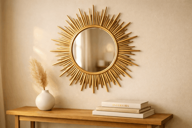

Styling Art 101: How to Arrange Wall Art Without Hiring a Designer
We’ve all been there. You buy a beautiful print, get home, hold it up against the wall, move it three inches left, then three inches right, stare at it for a bit, and then set it down on the floor and walk away. Two weeks later, it’s still leaning against the skirting board, still waiting.
Arranging wall art is one of those things that looks completely effortless in the homes you see on Pinterest, and feels absolutely overwhelming in your own space. The rooms that stop you mid-scroll don’t happen by accident, but they also don’t require a designer on speed dial. They happen because the person decorating knew a few rules that most people never get told.
Once you know those rules, everything clicks. You stop second-guessing yourself. You stop making holes you regret. And you stop buying art that’s technically lovely but somehow never quite right for the wall you bought it for.
This guide covers everything: the right hanging height, how to nail scale, how to plan a gallery wall without losing your mind, how to mix different styles without it looking chaotic, and the mistakes that are quietly ruining most people’s walls. No design degree required.
Quick answer: The key to arranging wall art is getting three things right: scale, height, and grouping. Hang art so its centre point sits at eye level, which is 57 to 60 inches from the floor. Choose pieces that are at least two-thirds the width of the furniture beneath them. And when you’re grouping multiple frames, treat the whole arrangement as a single shape, plan it on the floor first, and only then put a nail in the wall.
The One Height Rule That Solves Most Problems
If there’s one thing to take from this entire article, it’s this: you are almost certainly hanging your art too high.
It’s one of the most universal decorating mistakes, and it’s completely understandable. The wall above your sofa or your bed feels empty, so your instinct is to push the frame up toward that empty space. The result is art that hovers near the ceiling, disconnected from the room below it, more like a notice board than a design choice.
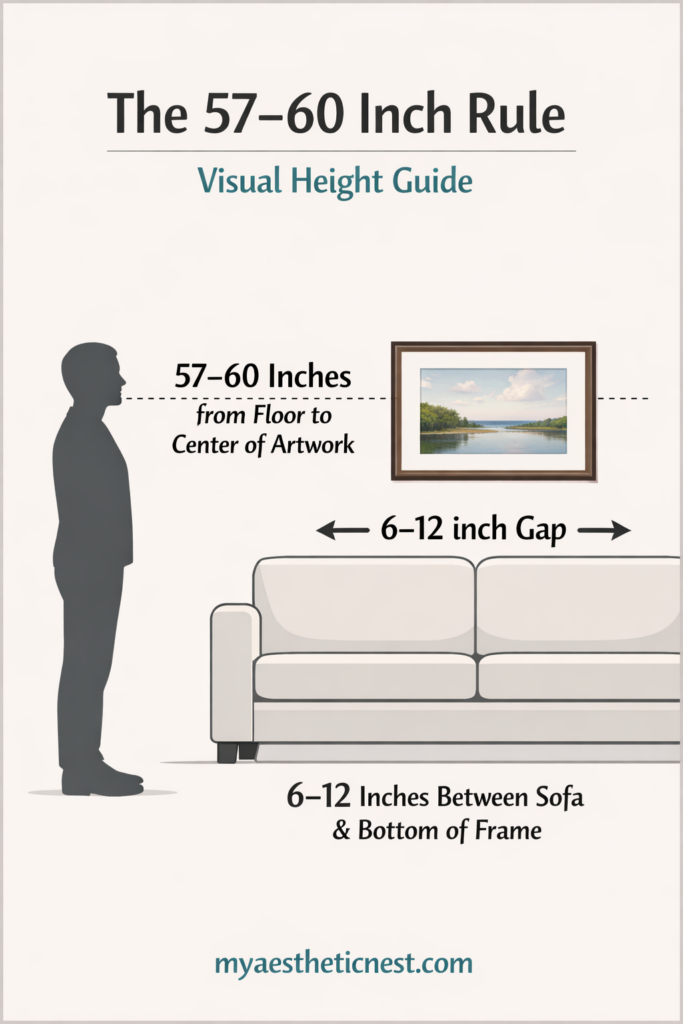
Interior designers follow a consistent standard: the centre of any piece of art should sit 57 to 60 inches from the floor. That’s roughly average eye level for a standing adult. At that height, art sits within the natural field of vision. It feels part of the room rather than above it. Galleries and museums actually use this same standard — it’s not arbitrary, it’s based on how humans naturally look at things.
When you’re hanging art above furniture, you need one additional adjustment. Leave 6 to 12 inches of gap between the top of the furniture and the bottom of the frame. Less than that and the art looks like it’s sitting on top of the sofa. More than that and the two things feel unrelated to each other — like they belong in different rooms.
One place where the rule bends slightly: stairwells. When you’re hanging a series of frames along a staircase wall, measure the 57-to-60-inch centre height perpendicular to the stairs rather than straight up from the floor beneath each piece. It keeps the visual line consistent as the staircase rises, which is what makes those arrangements look so intentional.
The fix for art that’s already hung too high is simple and free — take it down and rehang it lower. It will feel wrong at first. That’s just your eyes adjusting. Give it 24 hours and it’ll feel like it was always meant to be there.
Scale: Why Your Art Keeps Looking Wrong Even When It’s Nice
Scale is probably the most misunderstood element of wall art, and it’s responsible for that feeling where a room looks almost right but something’s slightly off and you can’t figure out what.
Here’s what’s almost certainly happening: the art is too small for the wall or the furniture it’s near.
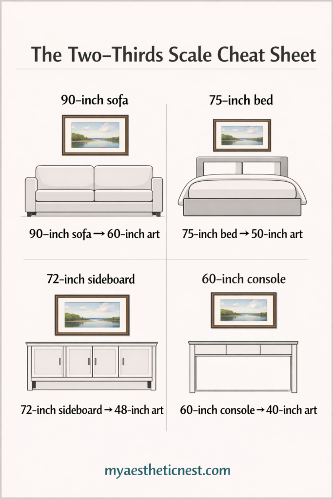
The principle designers use is called the two-thirds rule. Your art — or your full grouping of art — should be roughly two-thirds the width of whatever it sits above or relates to. So if your sofa is 90 inches wide, the art above it should span somewhere around 60 inches. That could be one large canvas or a gallery arrangement of multiple pieces — the total width is what matters.
Most people go too small. A single A4 or A3 print above a king-sized bed looks abandoned. One large canvas — 40 to 60 inches wide — looks deliberate and grounded. The instinct to go smaller is usually about caution: smaller feels safer because it’s less of a commitment. But in practice, undersized art consistently disappoints. When in doubt, go bigger than you think you need to.
A rough cheat sheet to work from:
- Above a standard 3-seater sofa (80 to 90 inches wide): aim for art or an arrangement 54 to 60 inches wide
- Above a queen-sized bed (60 inches wide): aim for 40 to 48 inches wide
- Above a sideboard or console table (48 inches): aim for 30 to 36 inches wide
- On a large blank wall with no furniture reference: art can span 50 to 75 percent of the wall width
The other dimension people forget about is height. A single landscape print on a tall wall can look just as lost as a small print on a wide one. Think about the wall as a complete space and consider whether you need vertical height as well as width — which is often where a gallery arrangement or a tall statement piece solves the problem.
How to Plan a Gallery Wall Without Ruining Your Walls

A gallery wall is the most flexible way to fill a wall with multiple pieces — and, for most people, the most stressful to actually put up. The anxiety is usually about making holes in the wrong places and ending up with a wall that looks like a game of pin the tail on the donkey.
There’s a simple process that takes all of that stress away.
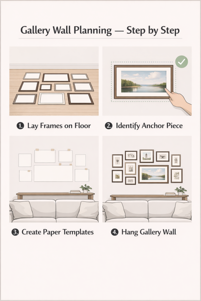
Step one: lay everything on the floor first.
Clear a floor space that roughly matches the wall area you’re working with and arrange your frames there. This is where you do all your experimenting — shuffling, swapping, rotating, editing. It costs nothing and destroys nothing. Keep going until the overall arrangement feels balanced and the shape feels intentional.
Step two: find your anchor piece.
Every gallery wall needs a hero — usually the largest piece, or the one with the most visual weight. Start by placing this at the centre, at eye level, and build outward from there. Don’t start from a corner or an edge; it’s much harder to maintain balance when you’re building from the side rather than from the middle.
Step three: decide on your spacing and commit to it.
Consistent spacing is what separates a curated gallery wall from a random collection of frames. Two to three inches between frames is the sweet spot for most arrangements. Less than two inches starts to feel cramped. More than four inches makes the pieces feel like separate art choices rather than a deliberate grouping.
Step four: use paper templates before you pick up a drill.
This is the step most people skip and almost everyone regrets skipping. Trace each frame on paper, cut out the shape, and tape the paper templates to the wall with painter’s tape. Step back and look at it. Live with it for a day. Walk past it. Look at it from different angles. You will catch things here that you’d never notice until after the holes were made.
Only once you’re genuinely happy with the arrangement on paper should you start drilling. Mark the hanging point on the paper template before removing it — that way your nail goes exactly where it needs to go.
One more thing on gallery walls: resist the urge to make every frame match. A wall of identical black frames with prints the same size is tidy, but it’s not interesting. Mix sizes and orientations freely — what creates cohesion isn’t uniformity, it’s consistent spacing, a shared colour thread, and that planned overall shape.
Mixing Different Art Styles Without It Looking Like a Jumble Sale
This is the question almost everyone has and very few people ask out loud: can you mix photography with illustration? Abstract with botanicals? A vintage oil portrait with a modern line drawing?
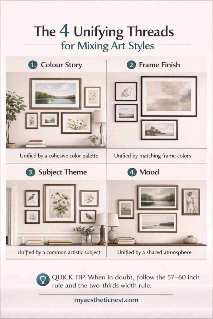
Yes. Almost always yes. The key is that you need one unifying element to tie the pieces together, even if everything else varies.
A shared colour story is the easiest way to do this. The pieces don’t need to be the same colour — they just need to each carry at least one colour that also appears elsewhere in the room or in the other frames. A touch of warm terracotta in every piece, for example, connects them even if one is a black-and-white photo and another is a colourful illustration.
Consistent frame finishes let you mix artwork completely freely. If every frame is the same — all black, all natural wood, all antique gold — the frames themselves create the cohesion. The art inside can be wildly varied and it’ll still look like a deliberate collection.
A shared subject or theme is the third option. All botanicals. All architectural prints. All portraits. All maps. The individual pieces can be completely different in style, era, and colour, but the subject matter creates a through-line that makes the wall feel curated rather than collected.
A consistent mood works too, though it’s the hardest to define. A wall where every piece feels calm and minimal hangs together even if the pieces are technically different styles. A wall where everything is bold and graphic does the same. What breaks the cohesion isn’t mixing styles — it’s mixing moods, where one piece feels completely out of emotional register with the others.
The mistake to avoid: mixing everything at once. Different frame finishes, different colour palettes, different subjects, different moods, all on the same wall. That’s when it tips from eclectic into chaotic. Pick one thread and let everything else vary around it.
Room-by-Room: Styling Art for Every Space in Your Home
Living room
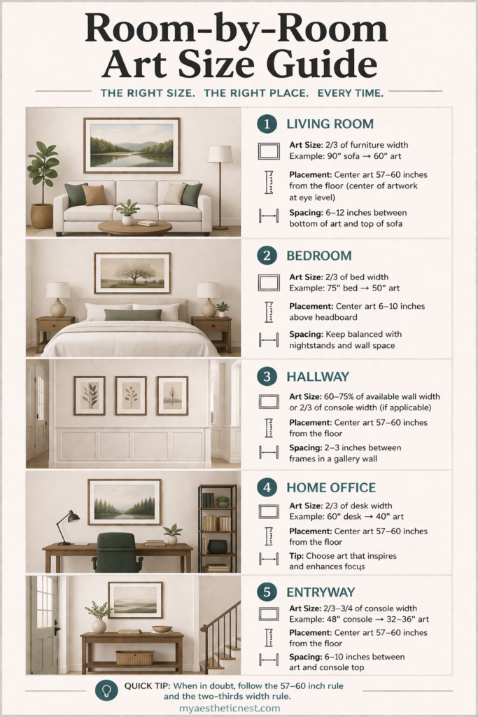
The living room is where you can afford to be bold. This is the main stage of your home — the place guests spend the most time, the space that sets the tone for everything else. One oversized canvas above the sofa, or a large, confidently planned gallery wall, does most of the heavy lifting.
Stick to the two-thirds rule for whatever goes above your sofa, hang at eye level, and don’t be afraid of large single pieces. A 48-by-48-inch canvas or a 60-inch-wide gallery arrangement will almost always look better than the smaller option you were considering.
If you want a more relaxed, layered feel, try leaning a large canvas or framed print directly on the floor against the wall, and layer smaller frames in front of or beside it. It’s a styling choice that reads as intentional and slightly editorial rather than just “I haven’t hung it yet.”
Bedroom
Bedroom art should feel calm. This isn’t the room for high-contrast, visually busy pieces — save those for the living room or hallway. Above the bed, the most reliable approach is a single large piece or a triptych (three panels) centred on the headboard.
For a queen or king bed, aim for 40 to 60 inches wide. Keep the bottom edge of the frame about six inches above the top of the headboard — close enough to feel connected to the bed, far enough to not look like it’s resting on it.
Soft photography, botanical prints, abstract washes of colour, and line drawings all tend to work well in bedrooms. Whatever you choose, it should be something you genuinely want to see first thing in the morning.
Hallways and entryways
Hallways are among the most underused display spaces in most homes. A strong linear arrangement along a hallway wall — all pieces hung at the same centre height with consistent spacing — creates a real design statement without requiring much depth or floor space.
Portrait-oriented art often works better in hallways than landscape, because the vertical format mirrors the proportions of the corridor. A series of five or six portrait-oriented prints at consistent spacing along a narrow wall can look genuinely spectacular.
Your entryway in particular deserves more attention than it usually gets. It’s the first thing you and every guest see. A single oversized piece, a small gallery cluster, or even a picture ledge with a curated set of frames makes an immediate impression.
Home office
Art in a home office should inspire without distracting. A busy, colourful gallery wall behind your desk can work if the pieces relate to your work or creative life, but a more focused environment usually means one or two larger, calmer pieces.
Architectural prints, maps, typographic art, and abstract line work tend to perform well in workspace settings — they’re visually engaging without demanding constant attention. One large framed piece behind or beside your desk at eye level when seated (slightly lower than the standing standard, around 48 to 52 inches to centre) usually lands well.
The Most Common Wall Art Mistakes — and What to Do Instead
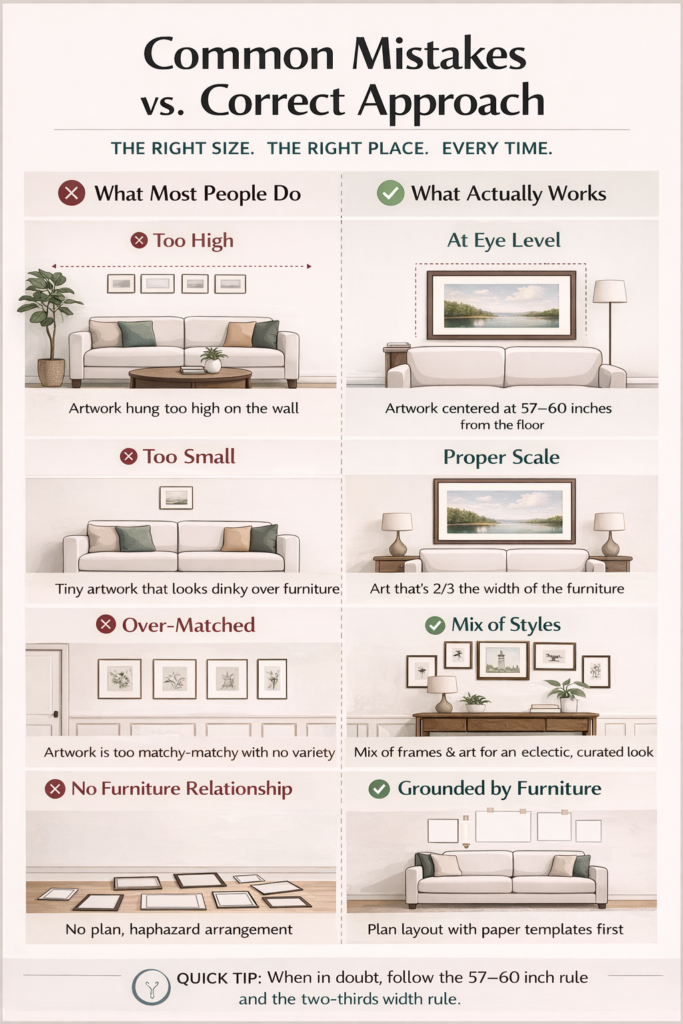
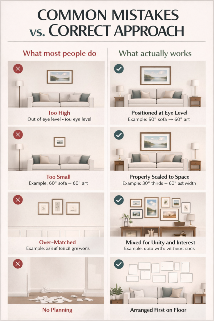
Hanging everything too high. Lower the art until the centre is at 57 to 60 inches from the floor. It will feel lower than you expect. That’s correct. Your eyes will adjust within a day.
Going too small. One medium print on a large wall almost always disappoints. Either size up significantly or create a grouping. The wall can comfortably hold more than you think.
Matching everything too precisely. A room where every piece of art is the same size, the same frame, the same colour, and the same style tends to feel corporate rather than personal. Intentional variation — different sizes, different subjects, one consistent thread — is what makes a space feel lived-in.
Ignoring the furniture relationship. Art that floats on a wall with no reference to the furniture below it feels disconnected and strange, even if the piece is beautiful. Art should always anchor to something — a sofa, a bed, a console, a shelf.
Skipping the planning step. Drilling first and rearranging second leaves holes in walls and regrets in hearts. Layout on the floor, paper templates on the wall, then drilling. Always in that order.
Choosing art based on a blank wall rather than the full room. The art you choose should relate to the colours, textures, and mood of the space it goes in. A piece that was perfect in the shop can look completely wrong on a wall that has nothing else to connect it to. Take a photo of your room before you shop, and refer to it constantly.
How to Hang Art Without Damaging Your Walls
If you’re renting, or you’re just cautious about putting too many holes in plasterboard, you have more options than you might think.
Command strips (the large, picture-hanging variety) are rated for up to 16 pounds per pair and genuinely work well for most medium-sized frames. The key is to remove them correctly — peel them off at a slow 90-degree angle, not straight out from the wall. Done right, they leave no mark at all.
Adhesive hooks work for lighter pieces — small frames, prints in light frames, canvas panels. Some brands specifically design their products for plasterboard, which is worth looking for.
Picture ledges are the best option if you want flexibility. You drill the ledge into the wall once — ideally into a stud — and then you can rearrange, swap, and add art as often as you like without making another hole. They’re particularly good for bedrooms and living rooms where you know you’ll want to change things over time.
Leaning art is entirely valid and increasingly common in well-styled homes. A large canvas leaning on the floor against a wall, or a smaller frame leaning against a shelf or mantelpiece, reads as deliberately relaxed rather than unfinished. It works especially well with oversized pieces that would be heavy to hang, and it lets you change things without any tools at all.
FAQs About Styling Art and Wall Art Arrangement
How high should you hang wall art?
The centre of a piece of wall art should sit 57 to 60 inches from the floor — roughly standard eye level for a standing adult. When hanging above furniture, leave a 6 to 12 inch gap between the top of the furniture and the bottom of the frame. Lower than you think feels right is almost always the correct answer.
How do you arrange multiple pieces of wall art?
Lay all your pieces on the floor first and treat the whole grouping as one shape. Find the largest piece and use it as your anchor, positioned at eye-level centre. Build outward from there, keeping 2 to 3 inches of consistent spacing between frames. Use paper cut-out templates taped to the wall before drilling to confirm the arrangement.
What size art should I get for above my sofa?
Your art or total arrangement should be roughly two-thirds the width of your sofa. For a standard 84-inch sofa, aim for 54 to 60 inches wide. One large canvas or a multi-frame gallery grouping of that total width both work well. When in doubt between two sizes, go with the larger one.
Can you mix different art styles on the same wall?
Yes — but you need one unifying element to tie them together. That could be a consistent frame finish, a colour that appears in every piece, a shared subject matter, or a consistent overall mood. The mix itself isn’t the problem. Mixing everything — styles, frames, colours, mood — all at once on the same wall is what tips it into chaos.
How do I plan a gallery wall without making loads of holes?
Trace each frame onto paper, cut out the shape, and arrange the paper templates on the wall using painter’s tape before you commit to any nails. Live with the layout for a day, adjust anything that feels off, and only drill once you’re completely happy. Mark the hanging point on the paper template before removing it so the nail goes in exactly the right spot.
What’s the best way to hang art in a rental?
Command strips work well for most small to medium frames — remove them slowly at 90 degrees to avoid paint damage. Picture ledges require only a single row of screws but give you complete flexibility to change art anytime. For heavier pieces, use proper wall anchors into studs — they cause minimal damage if removed carefully, and the small holes are usually covered by standard deposit deductions or a dab of filler.
Final Thoughts
Arranging wall art isn’t really a talent. It’s a set of principles applied consistently — eye level centre point, two-thirds scale, planned groupings, one unifying thread. That’s genuinely most of what interior designers use when they’re working on a client’s walls. The rest is just confidence and a willingness to step back and look.
What makes a space feel personal rather than just professionally styled is your choices within those principles. The pieces you picked, what they mean to you, whether they make you stop and look every time you walk past them.
Start with the one piece you love most. Hang it at 57 inches centre height. Everything else builds from there.