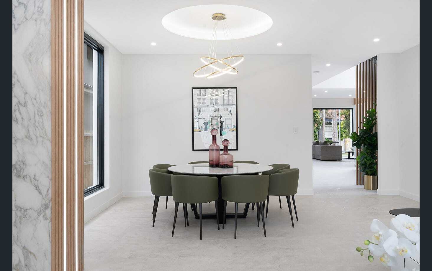
How to Choose a Color Palette for Your Home Without Overthinking It
You’ve stood in the paint aisle holding two swatches that look identical under fluorescent light, haven’t you? Choosing a color palette for your home doesn’t need forty tabs of Pinterest boards and a color wheel app. It needs one anchor color, a formula, and about twenty minutes with real paint on your actual wall.
Start With One Fixed Point, Not a Color You Like
Every home already has a fixed point you can’t change easily: a tile floor, a stone fireplace, a wood staircase, or a piece of furniture you’re keeping no matter what. That’s where your palette starts, not with a Pinterest board of colors you find pretty in isolation.
I’ve walked into dozens of homes where the client picked a gorgeous sage green for the living room, only to realize their oak floors pull warm yellow undertones that fight the green at every turn. The fix isn’t a different green. It’s picking the undertone of your fixed element first, then building outward from there.
Stand in the room that has the most permanent material and ask what undertone it leans toward: warm (yellow, orange, red base) or cool (blue, green, gray base). That single decision eliminates about half of every paint deck you’ll ever look at.
Use the 60-30-10 Rule to Structure the Palette
Professional designers rely on a ratio, not a vibe. Sixty percent of a room should be your dominant color, usually walls, large furniture, and flooring. Thirty percent is your secondary color, think curtains, an accent chair, or a rug. The remaining ten percent is your accent, reserved for pillows, art, and small decor objects.
This ratio matters because rooms without it feel busy even when every individual color is beautiful. A living room with a beige sofa, gray walls, a navy rug, mustard pillows, and a terracotta lamp isn’t ugly on paper, but without a dominant note, your eye has nowhere to land.
| Percentage | Role | Typical Elements |
| 60% | Dominant | Walls, large upholstery, flooring |
| 30% | Secondary | Curtains, accent chairs, area rugs |
| 10% | Accent | Pillows, art, vases, small decor |
Pick a Maximum of Four Colors for the Whole House
A cohesive home doesn’t mean every room is the same color. It means every room pulls from the same limited set, usually two neutrals, one mid-tone, and one accent that can flex from muted to saturated depending on the room.
I typically build a whole-house palette this way: a warm white or soft greige for trim and ceilings throughout, one deeper neutral for walls (a taupe, a warm gray, a soft clay), one mid-tone that shows up in furniture and larger textiles (navy, forest green, rust), and one flexible accent color that can go bold in a powder room and muted in a bedroom.
Why More Than Four Colors Backfires
Once you introduce a fifth or sixth unrelated hue, you’re forcing every room to work in isolation instead of as part of a house. Hallways and sightlines between open rooms are where this shows up fastest, because you can often see two or three rooms at once.
Test Paint on the Wall, Never on a Chip
A 2×2 inch chip under store lighting tells you almost nothing about how a color behaves in your home at 7am, at noon, and under lamplight at 9pm. Buy sample pots, not chips, and paint two coats on a poster board, not directly on the wall.
Move that poster board to at least three spots in the room over 24 hours: near the main window, on an interior wall, and beside any fixed element like your floor or cabinetry. Colors shift dramatically depending on which direction your windows face. North-facing rooms mute colors and pull them cooler; south-facing rooms warm everything up and can make a color read brighter than the can suggests.
A few testing habits that save you a repaint:
- Buy at least two candidate colors per room, never just one
- Paint the poster board on both sides so you can flip it against different walls
- Check the color at night under your actual bulbs, not daylight bulbs from the store
- Live with it for a full day before committing to gallons
Match Undertones Before You Match Shades
Two grays can look nearly the same on a swatch and read completely differently on adjacent walls if one leans blue and the other leans green. This is the single most common mistake I see in DIY palettes: people match lightness and darkness but ignore undertone entirely.
Hold your candidate paint next to your existing floor, counters, and any large furniture you’re keeping. If it clashes badly in that comparison, it will clash on the wall too, even if it looked fine on the store display.
Build Confidence With a Physical Mood Board
Before buying a drop of paint, gather actual physical samples: the paint chip, a scrap of your rug or curtain fabric, a piece of your flooring or a photo of it in natural light, and a swatch of your sofa or a cushion cover. Lay them together on a table in daylight.
Digital mood boards lie constantly because every screen renders color differently. A palette that looks stunning on your phone can look muddy in person. Physical samples, side by side, in the room’s actual light, are the only reliable test.
How Room Function Should Shape Your Color Choices
A palette isn’t just about matching the house, it’s about matching the job each room does. A home office benefits from cooler, calmer tones that support focus, think soft blues or muted greens, while a dining room can handle a richer, more saturated color because you’re rarely in there for hours at a stretch.
Bedrooms are where I most often push clients toward their most muted, dustiest version of a color rather than the version they fell in love with on a paint chip. A color that looks perfect at full saturation in a sunlit showroom can feel stimulating rather than restful once it covers four walls you sleep next to every night.
Kitchens and bathrooms see the most daily wear, both from moisture and from grease or steam, so beyond color, these rooms need a paint finish (eggshell or satin rather than flat) that can handle regular wiping down without burnishing or showing marks.
Common Mistakes That Undo a Good Palette
Even with a solid plan, a few habits consistently derail an otherwise good color palette:
- Choosing colors under artificial store lighting and never testing them at home before buying full cans
- Ignoring the flooring or cabinetry that isn’t changing and picking colors in isolation
- Going straight to trim color as an afterthought instead of choosing it alongside the wall color
- Changing the whole-house palette every time a new room gets decorated, rather than pulling from the same limited set
- Assuming a color that worked in a friend’s south-facing room will read the same in your north-facing one
Frequently Asked Questions
How many colors should a home color palette have?
Stick to three or four colors for the whole house: one or two neutrals, one mid-tone, and one accent. This keeps rooms feeling connected as you move between them, especially in open floor plans.
Should ceilings always be white?
No. A standard white ceiling works in most homes, but a soft tint of the wall color on the ceiling can make a room with low ceilings feel taller, while a deep or dramatic ceiling color works well in rooms you want to feel cozy, like a dining room or library.
What’s the easiest color palette for a first-time homeowner?
A warm white, a soft greige, and one mid-tone like navy or sage is nearly foolproof. It gives you flexibility across every room without requiring a strong sense of color theory.
How do I know if a color is too trendy to last?
If a color only exists paired with one specific style of furniture you see everywhere on social media right now, it’s trend-driven. Colors that have shown up in design consistently for decades, like navy, forest green, terracotta, and warm neutrals, tend to age better.
Can I use different color palettes in different rooms?
Yes, especially in closed-off rooms like a powder room or a home office. Just keep any color visible from a hallway or open living space tied to your main palette so the transition feels intentional rather than accidental.
What paint finish should I use in a kitchen or bathroom?
Eggshell or satin finishes hold up much better against moisture, grease, and regular wiping than flat paint, which can burnish or show marks over time in high-use rooms.
Final Thoughts
A color palette doesn’t need to be a personality test. Pick your fixed point, apply the 60-30-10 ratio, cap yourself at four colors for the whole house, and test everything on the actual wall before you commit to gallons. The homes that feel put-together aren’t the ones with the trendiest color; they’re the ones where every room clearly belongs to the same house.